The Salesforce Lightning Design System (SLDS) aims to create unified digital experiences across the Salesforce ecosystem. However, designers and engineers who consume SLDS often had difficulties determining what components/patterns to use when they needed to communicate with the user (for confirmation, information, error, etc).
As part of the Platform UX team, I was heavily involved in the birth of SLDS, focusing mostly on the design of form components. After the initial phase, I continued to be a part of the project and gathered feedback from product teams who used SLDS.
This process made me realize that there was a significant gap in the design system. While SLDS had a decent amount of components for the users to choose from, they existed as independent “atoms” with little context and guidelines around how to use them in a page or application.
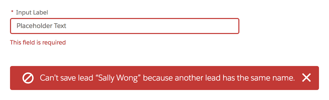
Adoption was a critical issue for a fledgling design system like SLDS. This gap, in particular, stumped designers and engineers frequently when they built their respective features. They guessed around a lot—a designer for feature A might use plain text to show an error message, while another designer for feature B decided to use a toast to convey a similar message. Unfortunately, this led to a wildly inconsistent experience across the board, which doesn’t inspire confidence in Salesforce.
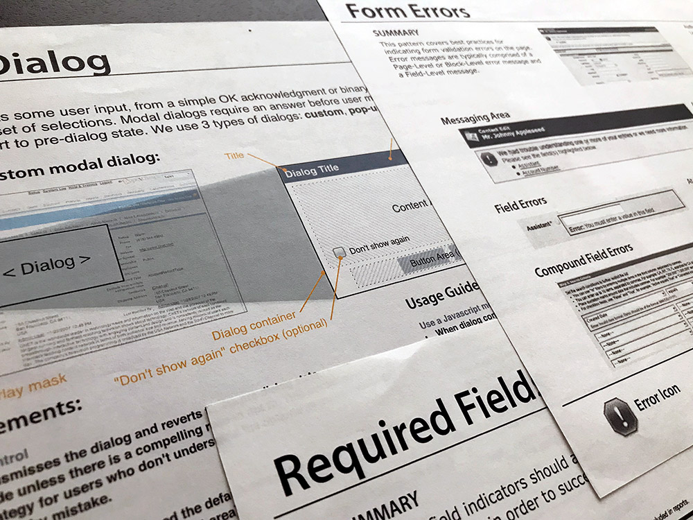
I began to explore ways to address this. The first step was to collect all the different messaging examples from various features so I could get a general sense of the diversity of messaging that’s possible within the ecosystem. Additionally, I looked at past examples of guidelines to understand what has been done before and learn from them.
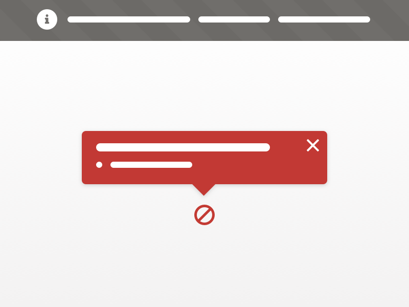
Messaging between the application and the end-user vary in tone, from subtle informational messages to dire system errors. Additionally, messaging can appear in various points of the user’s experience (e.g. when logging in, after filling out a form, before deleting a file, etc.).
As I delved in further, I developed some basic guiding principles for the framework:
- Timely, not noisy.
Deliver messages at the right time. Not every interaction requires messaging to go with it. - Informative, not verbose.
Say what’s necessary and not much more. - Actionable, not static.
Enable shortcuts for relevant actions to improve efficiency. - Cross device, not duplicative.
When appropriate, alert users on all their devices, but clear the messaging once user has read it.
In a nutshell, SLDS users were often aware that the components/patterns they needed did exist, but they didn’t know when and how to use these components. This became central to my design explorations for the framework.
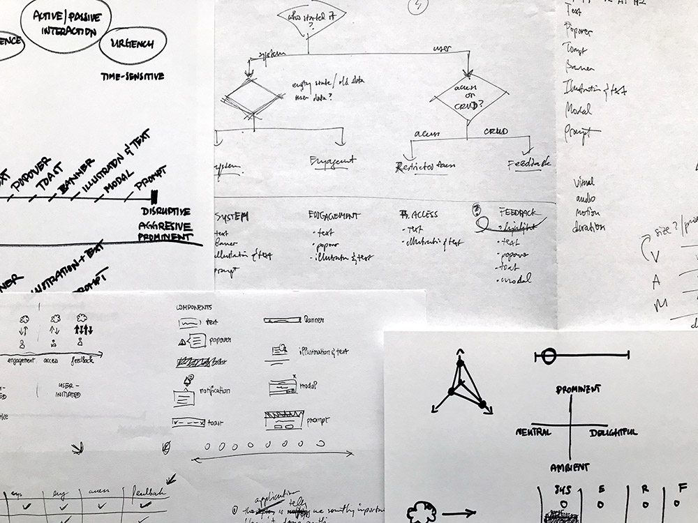
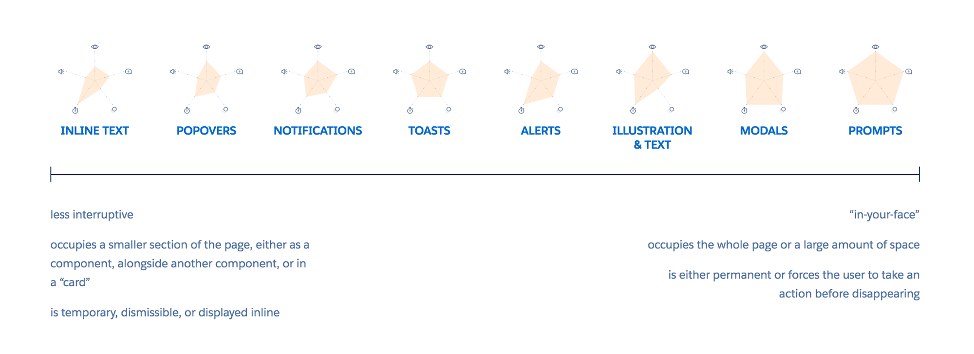
In one of the early approaches, I arranged the various components by “type,” ranging from system-type messaging (initiated by the system and alerts the user of important system-related issues or status) to feedback-type (initiated by the user and represents the system’ response to the user input).
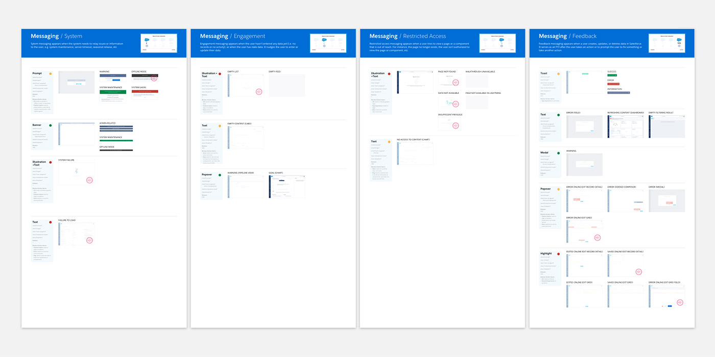
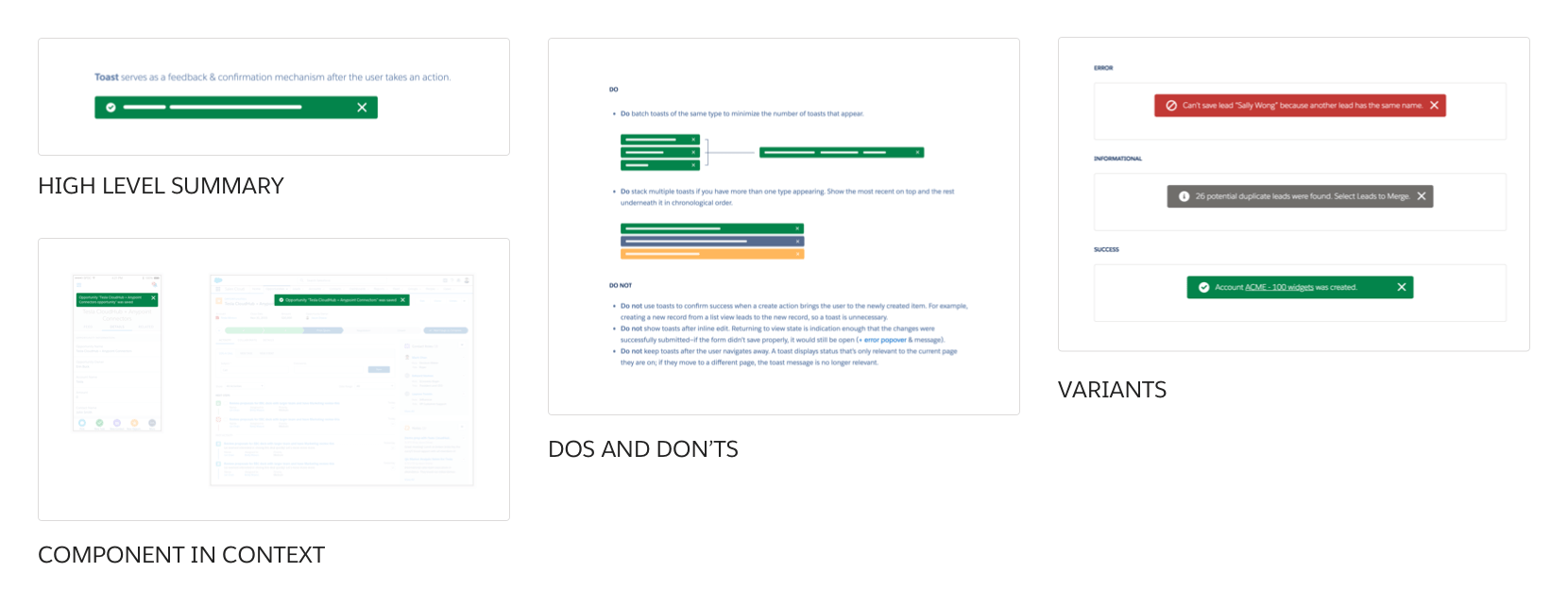
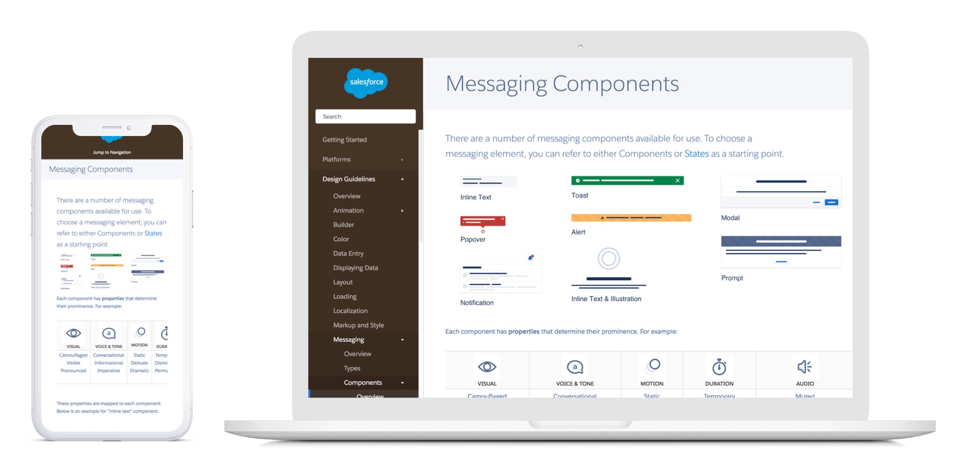
The guideline continued to evolve from this basic version. I added more comprehensive guidelines for each component that describe its usage, dos and don’ts, variants, etc. to help users understand the variety of contexts that are available for use.
As I added usage details to these components, it also became apparent that different components fit within the UI differently. A modal, for instance, would pop up in the middle of the screen and block the user from doing anything else until they close it. On the other hand, a new notification item would simply sit outside of the user’s workspace and were generally not as disruptive to the user.
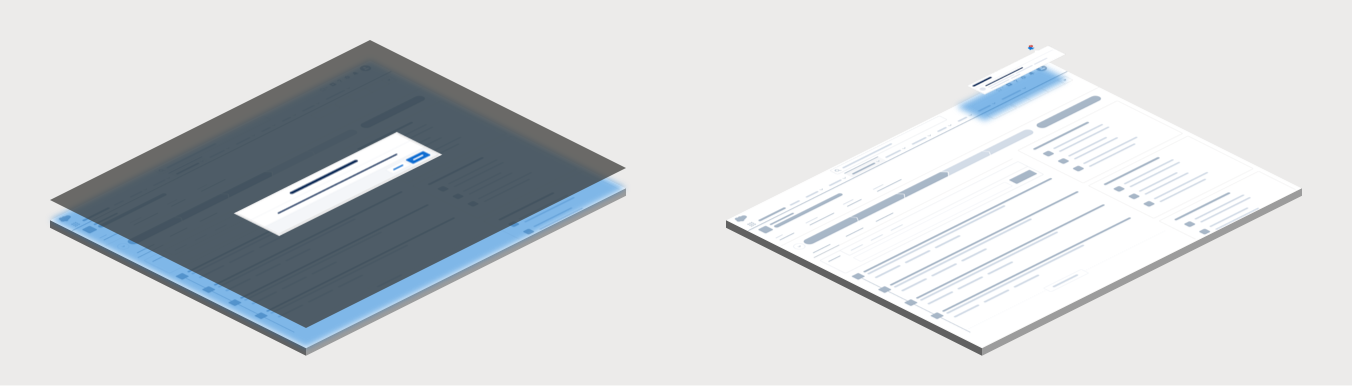
By thinking about the UI components through this lens, I was able to map various properties to each and come up with an order that made sense.
As the framework developed, I shopped it around to a number of SLDS users to get feedback. While the users were delighted that a framework was emerging, this version simply wasn’t clear enough for them.
Seeing usage guidelines for each component and how the components were ordered made sense. However, this didn’t quite match the common mental model; a user typically wouldn’t think of the component as a starting point. Instead, they usually thought about the state first, e.g. “I need to show an error message in this flow,” or “What is the empty state for a new list?” etc.
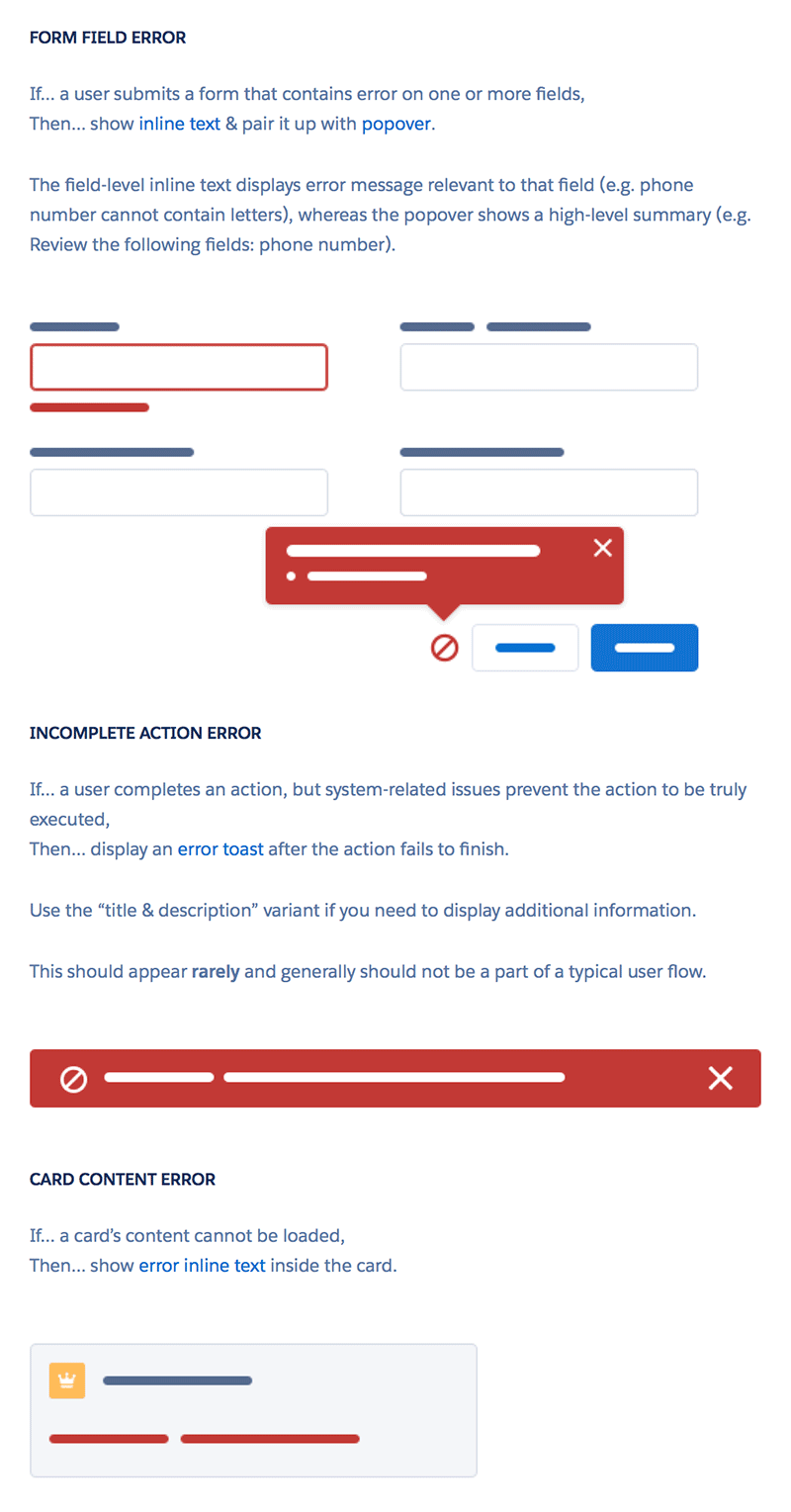
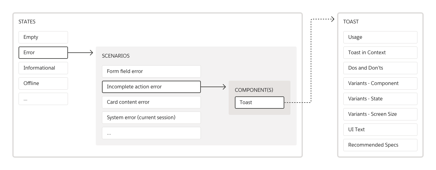
This discovery helped me evolve the framework. For the next iteration, I put together a number of common states, typical scenarios (for each state), and specific component guidelines (one for each scenario).
Each of the component guideline here also linked back to the primary component page, which contains more details and examples. This information architecture enabled users to find the specific guideline they needed quickly.
This addition made a major difference, as it fit the user’s mental model more closely. The users who saw the revised framework were able to find the help they needed much more efficiently.
Additionally, as I continued to refine the framework, I collaborated closely with the Documentation team to define the UI text patterns and examples, which also became part of the framework.
The messaging framework started off as a personal design exploration to address a gap within SLDS and I built it separately from the main design system by choice. At the time, the main design system environment didn’t have an easy way for contributors to add/edit content. As such, building the draft framework in a separate environment gave me far more flexibility and velocity, which was essential in the early stages.
As I refined the framework and shared it with others, it quickly became a go-to resource for SLDS users. The enthusiastic response demonstrated that the “framework” concept was highly valuable for users, which convinced the SLDS team to integrate it to the main design system site. The messaging framework became an official part of the Lightning Design System as of SLDS v2.2.
What started off as a personal project has now become an essential part of Salesforce’s design system. The framework takes out guesswork around messaging and helps designers and product teams build their features with more confidence, while ensuring a clear and consistent experience across products. More importantly, it set an exemplary standard for other SLDS guidelines in development.
A new design system may start out with what the basic components are, but as it matures and scales, the system needs to address when to use them and how these components work together to create an experience. The Lightning Messaging Framework is an example of that evolution.